Go Back   EQEmulator Home > EQEmulator Forums > OpenZone > OpenZone:: Q&A

OpenZone:: Q&A Support forum for OpenZone help

Reply
 
Thread Tools Display Modes
  #1  
Old 08-30-2014, 01:11 AM
knowom's Avatar
knowom
Discordant
 
Join Date: Jun 2006
Posts: 371
Default The Legend of Evercrack

LOL seems like a semi appropriate title for this zone/project. Anyway for a bit of a idea of what is going on to the uninformed refer to this link and page 7 & 8.

http://www.eqemulator.org/forums/sho...t=38384&page=7

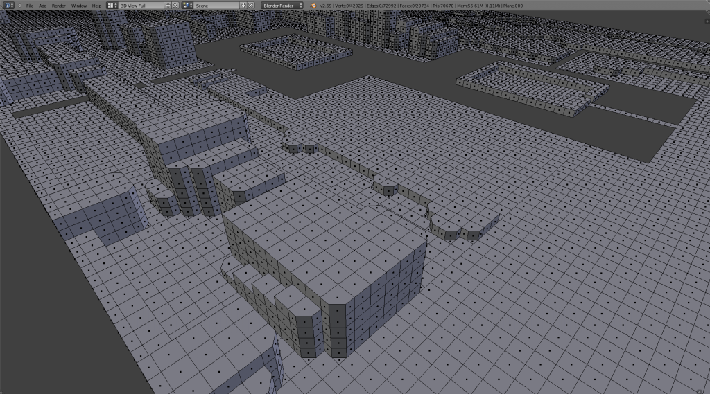
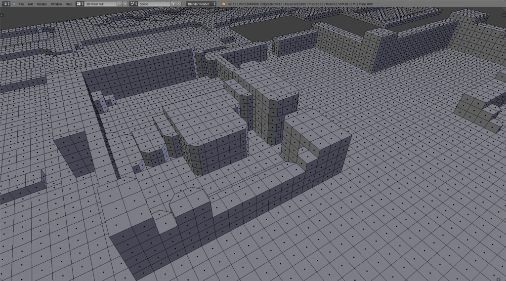
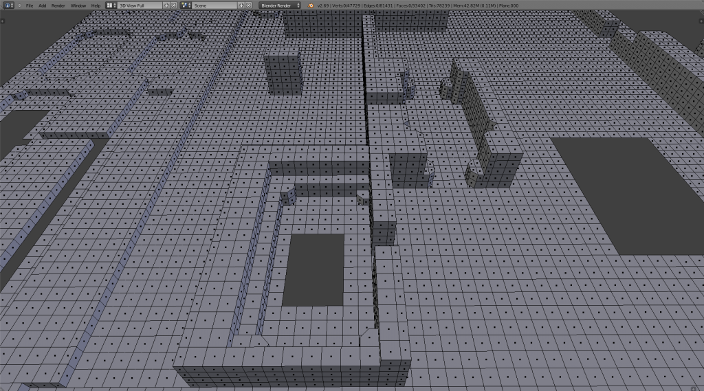
Basically to summarize it's my 3D interpretation of "The legend of Zelda" or zone based around the original map layout of Hyrule if you will in 3D. I'll likely release it in 2 separate versions one that's more basic and what you'd expect a semi accurate 3D interpretation. The latter version though will be a 4-way mirrored take on it with a bit of change variations to spice it up and make things a bit more interesting and different.

Anyway here's the latest screen shot of how it's turning out. I finally finished up adding the terrain details to all the terrain juts, cracks, and crevices to make it look a bit closer in design. Still probably not quite perfect replica perhaps, but does seem quite a bit closer looking and feeling now.
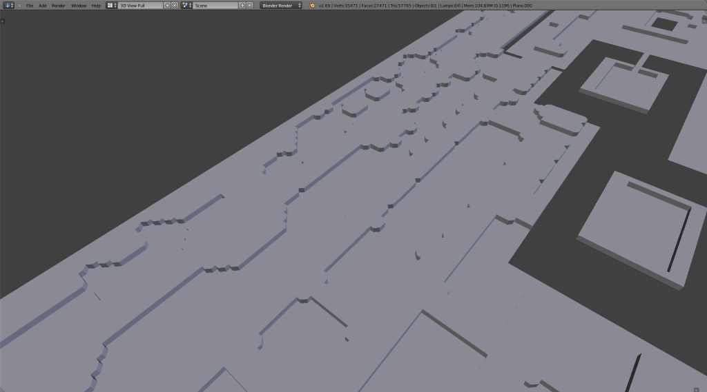


I started cleaning up a bit more excess faces as well by doing some limited dissolve to the faces in Blender as a well on the split squares that formed half tile rectangles that was used to help get the design accurate. This will reduce the overall faces, triangles, edges, and vertices total so I can have more room to add more detail or should help make zone as smooth as possible. I haven't yet gotten to adjusting the full terrain height completely I just did some initial height adjustment to give a general bit of depth to help portray the layout more easily to give a good impression. I'm pretty certain the coming stages of planned tweaks will make a more noticeable difference in appearance.

Even in it's current state though it could probably at a point where database spawn points could be made or started Z axis height might need some later tweaking which is minor. That's assuming someone was interested in turning this into some kind of fun custom server my hopes is to get a few dedicated developers interested in turning this into the start of custom 4-way faction vs faction server.

Click if you want to see it in bit higher resolution for a better view. It still needs to be UV textured, but can only do so much at a time.
__________________
"We are all on the same team, and I think not enough people realize this."
- Leetsauce
Reply With Quote
  #2  
Old 08-30-2014, 08:14 PM
knowom's Avatar
knowom
Discordant
 
Join Date: Jun 2006
Posts: 371
Default

Decided to put up the blender file for it in it's current form if anyone's interested they can take a look at it export it as a object file to be converted over to zone with zone importer and possibly work on creating zone spawns around the zone layout itself.

Feel free to experiment with adjusting the terrain height if you wish to get a idea of how it might look later on. I did a little bit of that for 3-4 minute a moment ago and I think it's going to look really sweet with better Z-axis height depth. I know just having it textured as well will make a enormous visual difference as well. More updates later, but still have plenty of clean up busy work to do reduce overall total vertices, edges, and faces.

https://drive.google.com/file/d/0B1Y...it?usp=sharing
__________________
"We are all on the same team, and I think not enough people realize this."
- Leetsauce
Reply With Quote
  #3  
Old 08-30-2014, 11:28 PM
Davood
Discordant
 
Join Date: Jan 2005
Posts: 488
Default

this is an excellent idea...That is one of the best game series ever .

i asked you a message in private because i'm not sure if we can talk about it or not - but if so id like to do some armchair help and suggest lots of stuff for you and others to do that I can't do myself.
__________________
----------
Demon Overlord of Alakamin
skype @ davoodinator
Reply With Quote
  #4  
Old 08-31-2014, 01:18 AM
knowom's Avatar
knowom
Discordant
 
Join Date: Jun 2006
Posts: 371
Default

I just thought it would be cool to try to do and good way to challenge myself to learn how to use Blender better. I think it's got good potential even though it is a single zone. Technically four if I mirror it that way I was thinking of doing which each zone could be a slightly different versions perhaps each could have a separate theme toward the four different seasons.
__________________
"We are all on the same team, and I think not enough people realize this."
- Leetsauce
Reply With Quote
  #5  
Old 09-01-2014, 06:49 PM
knowom's Avatar
knowom
Discordant
 
Join Date: Jun 2006
Posts: 371
Default

Cleaned up the faces the way I was looking to do so the best I could. This Blender file is more up to date if anyone did wants it.

https://drive.google.com/file/d/0B1Y...it?usp=sharing

Finally back to working on actually fixing height properly. I'll give a example sample of what I have in mind in a bit tonight or tomorrow most likely.

I'm leaning towards going making majority of upper portion of the map higher elevation than lower portion though with some variation tossed in make it interesting. Haven't quite decided how the actual tops will be if they will be somewhat flat and cannon/plateau in design or mountainous or a mix of both. It's defiantly a artistic decision I'll have to wage and judge a bit as I go I think, but was kinda leaning more toward a semi flat plateau design because then perhaps it could be utilized a bit.
__________________
"We are all on the same team, and I think not enough people realize this."
- Leetsauce
Reply With Quote
  #6  
Old 09-01-2014, 07:25 PM
knowom's Avatar
knowom
Discordant
 
Join Date: Jun 2006
Posts: 371
Default

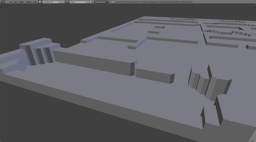
Just a quick sample on how it could end up looking. I think I'll start by doing more like the top part half of screenshot example and then later do a bit of the bottom selectively to make it better overall aesthetically. Not aiming for hyper realism or anything, but also not going for Minecraft quality either. I want it run decent, but have some artistic nuisances that players hopefully will appreciate.

__________________
"We are all on the same team, and I think not enough people realize this."
- Leetsauce
Reply With Quote
  #7  
Old 09-01-2014, 08:14 PM
Drajor's Avatar
Drajor
Developer
 
Join Date: Nov 2012
Location: Halas
Posts: 355
Default

I would love to see cshome remade and put into circulation!
__________________
Drajor regards you indifferently -- what would you like your tombstone to say?
Reply With Quote
  #8  
Old 09-02-2014, 02:26 PM
knowom's Avatar
knowom
Discordant
 
Join Date: Jun 2006
Posts: 371
Default

Did the first bottom left corner screen section of map and cleaned up all the extra extrusion faces underneath the map plane after I doing so. This is basically what I'll be tackling on a section by section basis. After I'll probably toss in some styling touches like I demonstrated a bit of in that last screenshot.


So far I'm pretty satisfied though with overall results it looks a lot like the way I originally envisioned it would in my imagination so it's pretty cool to see it really come to life a bit finally. I stumbled upon this too which was interesting to browse and read a bit on. Seems I went about it the right way more or less to transform it from 2D into 3D.

http://critical-gaming.squarespace.c...2d-3d-pt1.html
__________________
"We are all on the same team, and I think not enough people realize this."
- Leetsauce
Reply With Quote
  #9  
Old 09-02-2014, 09:50 PM
knowom's Avatar
knowom
Discordant
 
Join Date: Jun 2006
Posts: 371
Default

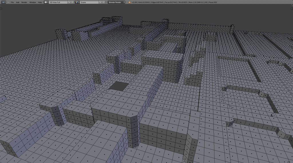
Another screenshot showing off a bit of a progress. It's gives you a decent idea on how I've gone about the creation process. It's not overly difficult honestly.

__________________
"We are all on the same team, and I think not enough people realize this."
- Leetsauce
Reply With Quote
  #10  
Old 09-03-2014, 12:28 PM
knowom's Avatar
knowom
Discordant
 
Join Date: Jun 2006
Posts: 371
Default

Another day another screen teaser!


It's hollowed out and inverted underneath the extruded terrain part's which I could probably make nice use of that and turn them into a inverted underground dungeon. The cool part is you could use all the bomb wall locations as entrances to that just use some hidden transparent walls like in Guk or Mistmoore Castle or a wall that slides open with a key like entrance into The Hole. Could potentially add in a invisible bridge like The Deep had below dungeon #4 to reach the tops of those cliffs that might be kinda cool.
__________________
"We are all on the same team, and I think not enough people realize this."
- Leetsauce
Reply With Quote
  #11  
Old 09-03-2014, 07:52 PM
knowom's Avatar
knowom
Discordant
 
Join Date: Jun 2006
Posts: 371
Default

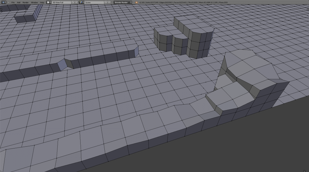
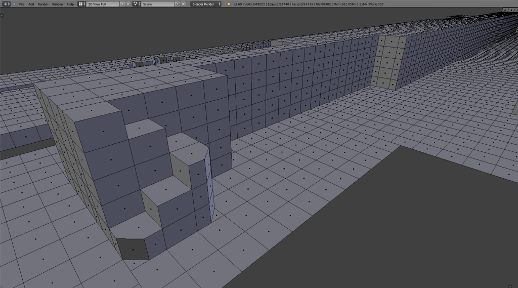
Wondering what people think about this ledge stairway? Given the way that pathway narrowed I felt the aesthetics would pair well. I'm trying to intentionally toss in some variation within the 3D extrusion. Anyway just curious what people's thought are on it.


I don't really know if there is much overall interest in this project or not it's difficult to tell not much comments to go by on the other hand seems like a fair amount of people have been checking the thread. Hoping it's merely a case of "If you build it they will come" field of dreams.
__________________
"We are all on the same team, and I think not enough people realize this."
- Leetsauce
Reply With Quote
  #12  
Old 09-03-2014, 11:36 PM
knowom's Avatar
knowom
Discordant
 
Join Date: Jun 2006
Posts: 371
Default

I'm not sure if I'll keep that stairway ledge in the previous screen shot. In part simply because I kind of made a better one I feel in the next section over that I think feels more natural to me.

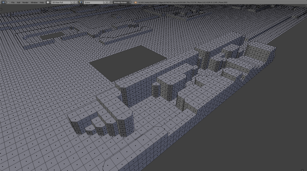
Anyway latest screenshot update that's it for tonight.


Long winded side note) I had mentioned Guk Bottom has 31,391 faces & Temple of Veeshan has 30,971 faces. Currently Legend of Evercrack is sitting 30,188 faces though I'm estimating it to be about 35,000-40,000 by the time it's done with all the 3D extrusions as far as I can tell that is. So I tried to find a better benchmark zone to go by that pushes limits a bit more Plane of Nightmare seemed decent enough it's rather enormous in size. So exported it to .OJB and imported it into Blender. Anyway PoN has 286,960 faces that's a bit over 9 times Guk Bottom or Temple of Veeshan yikes! Long story short I likely don't have to worry to much about making to large or complex a zone. I could probably mirror design 4 times over like I had in mind and keep it a single zone yet still have less than half as many faces as PoN.
__________________
"We are all on the same team, and I think not enough people realize this."
- Leetsauce
Reply With Quote
  #13  
Old 09-04-2014, 03:31 AM
Drajor's Avatar
Drajor
Developer
 
Join Date: Nov 2012
Location: Halas
Posts: 355
Default

Your geometry is not optimised. I estimate you will be at 800-1200 polys once optimised. Modern hardware will not even sneeze at this.
__________________
Drajor regards you indifferently -- what would you like your tombstone to say?
Reply With Quote
  #14  
Old 09-04-2014, 04:49 PM
knowom's Avatar
knowom
Discordant
 
Join Date: Jun 2006
Posts: 371
Default

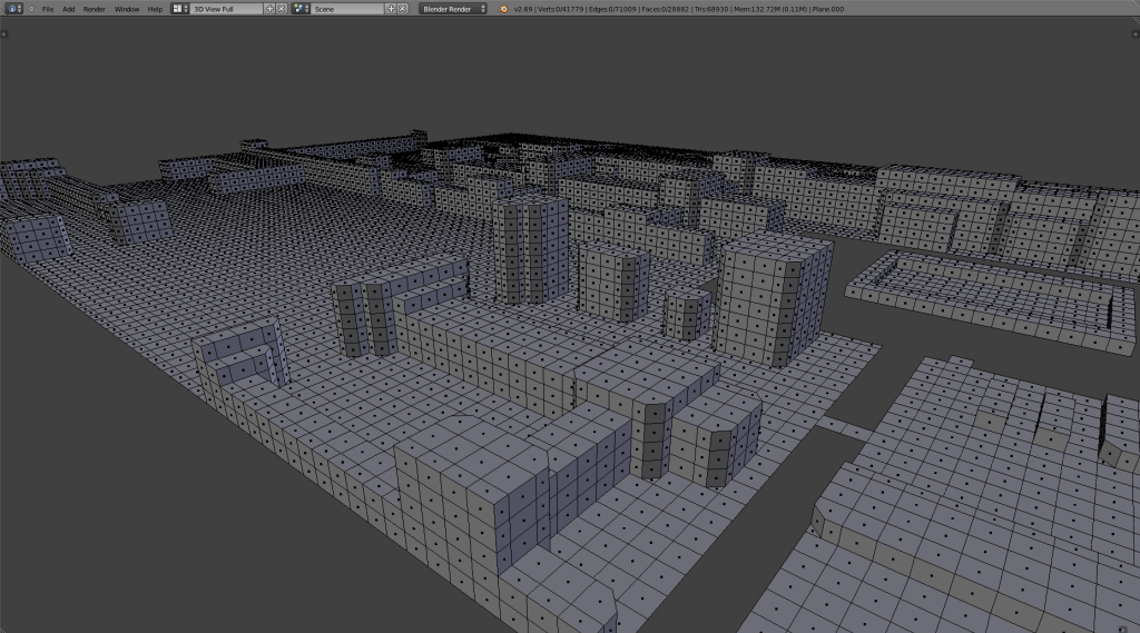
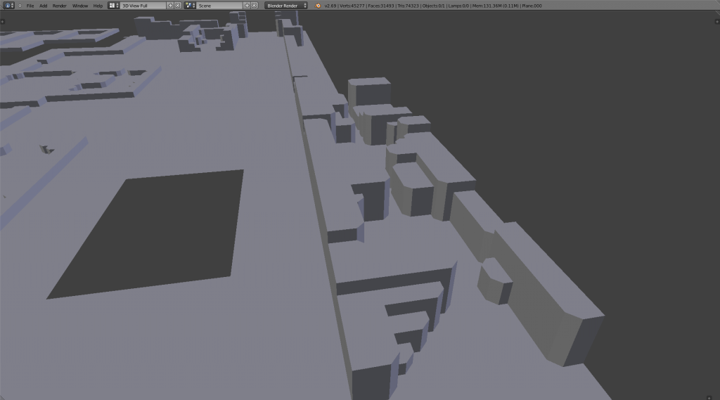
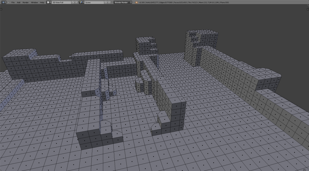
Few more screenshots on how it's coming. Some community feedback btw on how it looks if anyone has some is certainly welcome.


__________________
"We are all on the same team, and I think not enough people realize this."
- Leetsauce
Reply With Quote
Reply


Posting Rules
You may not post new threads
You may not post replies
You may not post attachments
You may not edit your posts

BB code is On
Smilies are On
[IMG] code is On
HTML code is Off

Forum Jump


All times are GMT -4. The time now is 01:43 PM.


Everquest is a registered trademark of Daybreak Game Company LLC.
EQEmulator is not associated or affiliated in any way with Daybreak Game Company LLC.
Except where otherwise noted, this site is licensed under a Creative Commons License.
       
Powered by vBulletin®, Copyright ©2000 - 2024, Jelsoft Enterprises Ltd.
Template by Bluepearl Design and vBulletin Templates - Ver3.3